Illustrations
Illustrations are used to depict processes, functions and other abstract facts. Their use can range from educational to inspirational. A clear and decisive design language is a key component of the GEZE illustration style.

Style
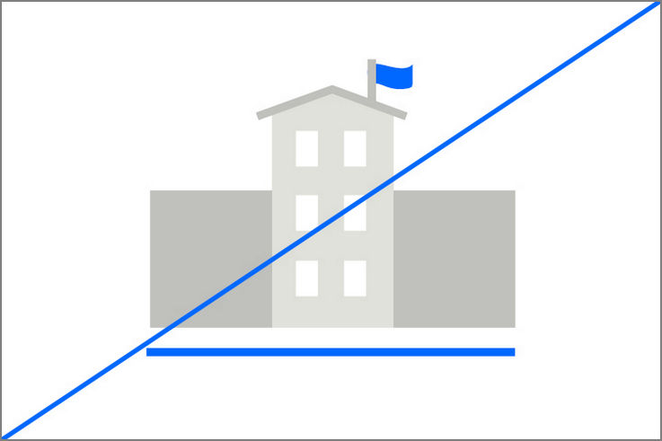
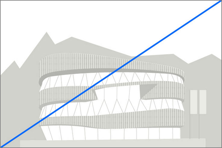
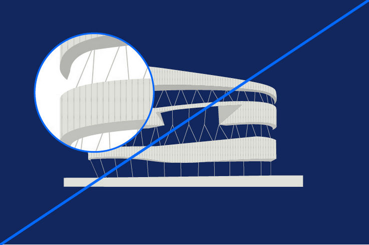
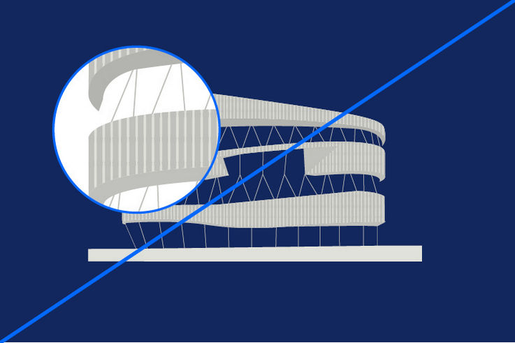
The GEZE illustration style is characterised by full-surface shapes without outlines. There are no gradients or soft transitions.
Lines contrast with the surfaces and ensure the high quality required.
Pattern areas break up the shapes and create a connection to the frames.

Perspective
Objects obtain depth through the use of light and shadow, represented by two-dimensional shapes in different brightness gradations. Objects in the background are softened.
The perspective is not definitive. Consistency of the style is maintained by the consistent use of colour and surface systematics.

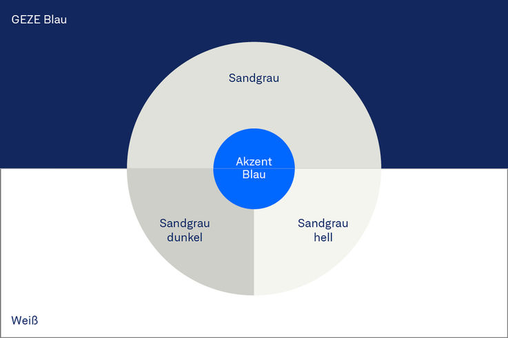
Colour scheme
The dominant colour of the elements is sand grey. For modelling with light and shadow, a darkened or brightened version and white colour can be used. White must be used in every illustration and is an important element in creating a high-quality appearance.
Accent blue should be used in proportion to convey the message, but not too prominently. GEZE yellow is not used in illustrations.

Extension of the colour palette
The colour palette has been extended for the illustration style. Colours derived from the sand grey are available in brightness gradations of 10% in order to be able to reproduce even more complex motifs that reflect reality. The use of black is still not permitted here. The exact colour values and colours for download can be found in the ‘Colours’ section.


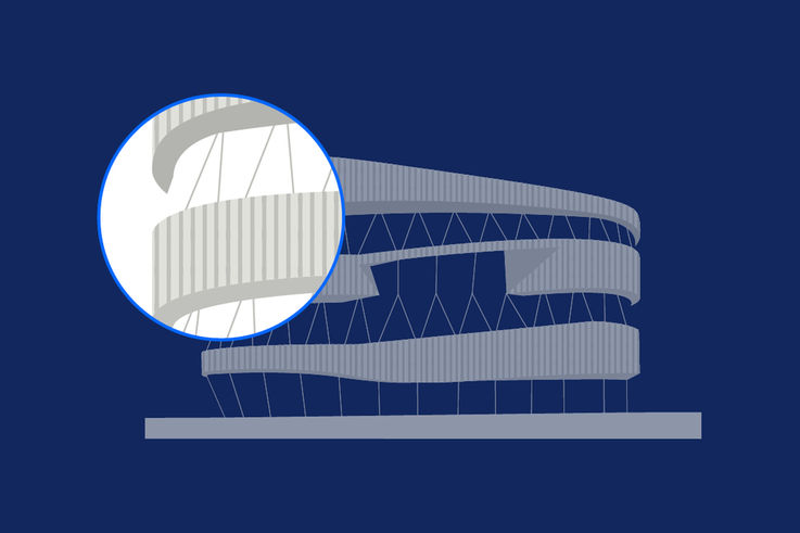
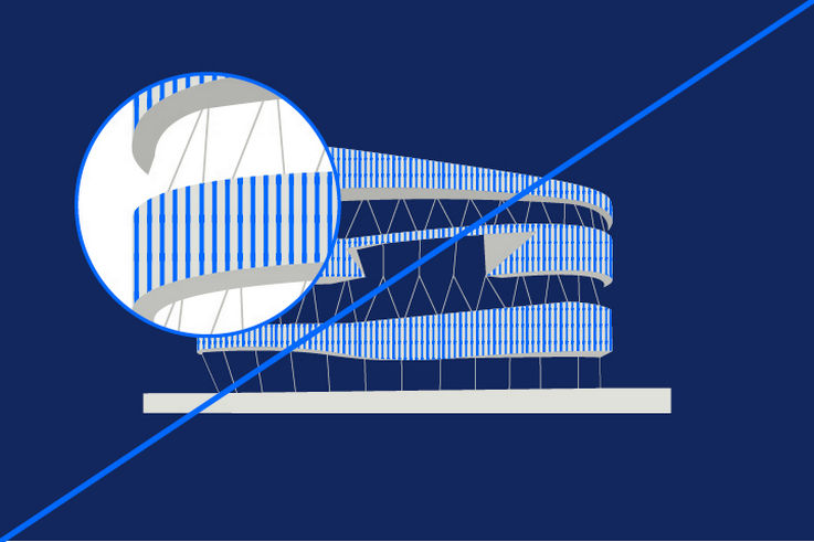
Use of the pattern area
Frames are interpreted as pattern areas in illustration style. They break up surfaces, act as a link to the design principle and give the illustration style a unique character. If possible, they should be integrated into every illustration.
The pattern area is to be kept in the grey tones of the illustration style. The line elements are always vertical. The mirror projection of the pattern area must be adjusted according to the size of the illustration.
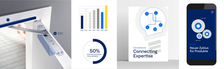
Combination with icons
Illustrative depictions can be combined with GEZE icons.
Icons are primarily depicted in GEZE blue or Accent blue to create a high contrast against the basic illustration.
Applications
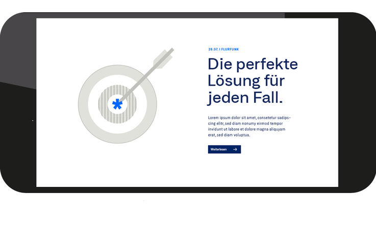
Simple metaphors
Illustrations are usually used in combination with text, language or images; they support a message and emphasise the context. They must never be used to tell the whole story on their own.
In designing a narrative motif, it is important to identify simple metaphors. Which details are really necessary for understanding an illustration? If in doubt, leave it out.
Combination with photography and moving images
Illustrative elements are used in combination with photography and moving image with lines in Accent blue as emphasis. In these situations, as well as ensuring clear legibility, care must be taken to ensure that the character or function of the product is not adversely affected by the illustration.

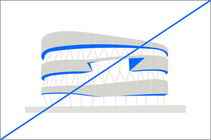
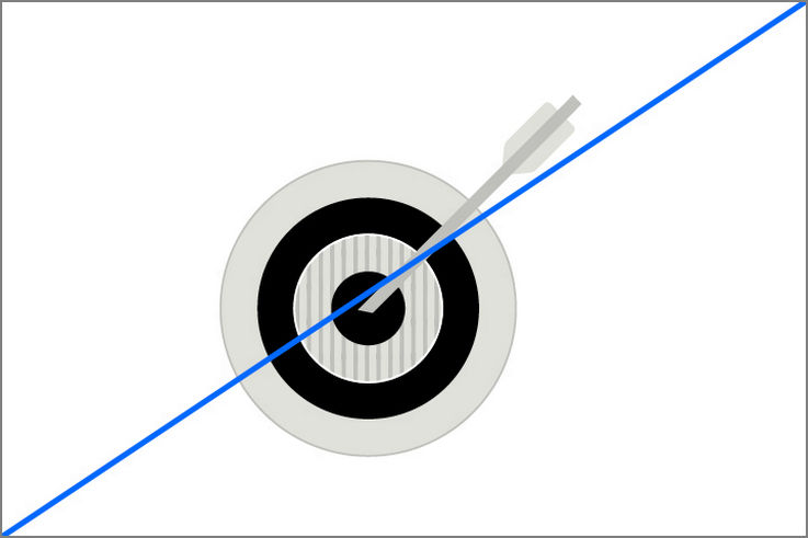
Emphasis on particularly important image components
An area in GEZE blue is used to highlight partial areas of a photograph or a crop. This area is 20%. An additional contour of the colour Accent blue frames the area to be highlighted and creates focus.
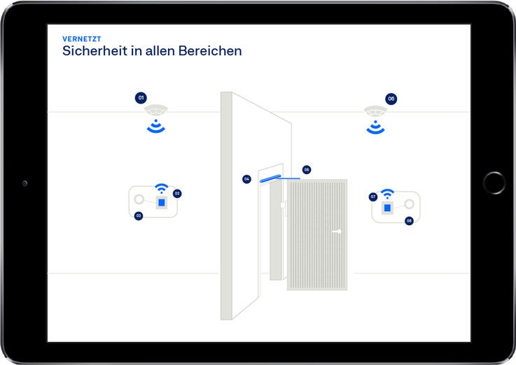
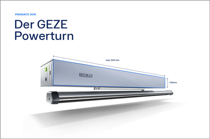
Illustration in construction drawings
Construction drawings are given the unmistakable GEZE style by the colouring in sand grey and the labelling of context-relevant elements in Accent blue.
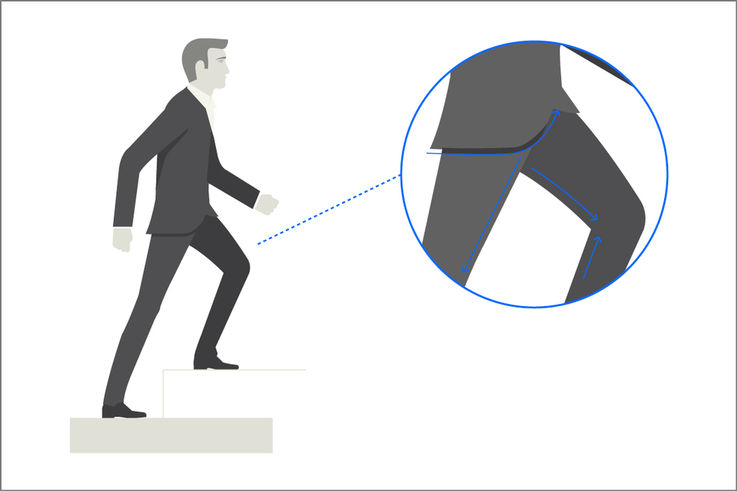
Figurative depiction
Adhering to the degree of abstraction is essential in figurative depictions in particular. The design language is reduced, lines are defined and straightforward. Clear, angular shapes create a sense of dynamic. In addition, the simplicity of the scene must be considered. Contents in the background are softened.


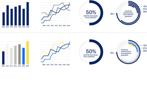
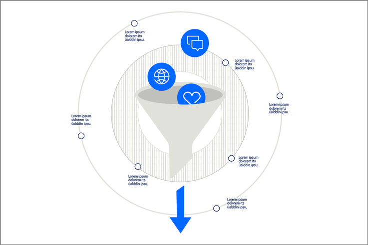
Infographics
Visualise numbers in line with the design guidelines
Infographic depictions are created using the defined GEZE colours. Sand grey thin lines can be used as reference lines.