
Basic elements
The new world of GEZE is characterised by simple, clear and considered corporate design building blocks, with a combination that ensures a distinctive brand experience. The following pages show how we bring the brand to life.

Design principles
The design principle is at the helm of the basic elements. It explains how to use logos, typographies and colours, and is the core of GEZE brand awareness.

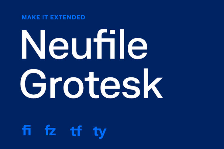
Progressiveness in typography and colour pattern
The design is characterised through liberal use of white space, intensive colours and maximum contrast. The typography should preferably be designed to be eye-catching.
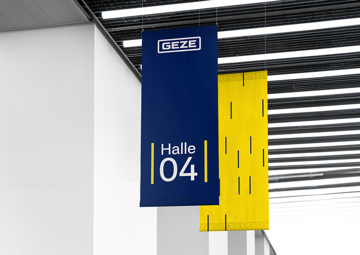
Frames – Opening endless possibilities
In addition to the design elements such as the logo, colours, font and image style, frames are an important feature of the brand awareness. Frames help to emphasise important messages, act as a call to action and provide structure for contents. They are composed of two horizontal lines, and can appear in a wide variety of abstraction levels.
More about design principles
Imagery
GEZE's imagery scheme consists of three pillars: Products, people and architecture. Each field affects the company's market position. A balanced relationship between these fields creates a coherent overall image of the brand.
Read more